 inch-blog
ライブラリのインストール
シンプルな折れ線グラフ
折れ線・散布図・棒グラフの複数のグラフを描画
折れ線・散布図・棒グラフの複数のグラフをそれぞれ描画
エラーバー付きのグラフを描画
複数の棒グラフを描画 1
複数の棒グラフを描画 2
x 軸のメモリ値を回転して描画
軸のメモリの表記を変えて描画
画像と文字列を表示
ライブラリのインストール
!pip install -q matplotlib japanize-matplotlibシンプルな折れ線グラフ
import matplotlib.pyplot as plt
import japanize_matplotlib
import numpy as np

fig = plt.figure(figsize=(6.4, 4.8))
fig.suptitle('title')
# plt.subplots_adjust(wspace=0.2, hspace=0.2) # グラフ間の幅調整

ax = fig.add_subplot(1, 1, 1, xlabel='$x$', ylabel='$y$')

x = np.arange(0, 20, 1)
y = 2 * x * x

ax.plot(x, y, label="$y = 2x^{2}$")

ax.legend()

fig.savefig('example1.png') # eps, jpeg, jpg, pdf, pgf, png, ps, raw, rgba, svg, svgz, tif, tiff

# 画像を閉じる
# plt.clf()
# plt.close()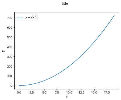
折れ線・散布図・棒グラフの複数のグラフを描画
import matplotlib.pyplot as plt
import japanize_matplotlib
import numpy as np

fig = plt.figure(figsize=(6.4, 4.8))
fig.suptitle('title')

ax = fig.add_subplot(1, 1, 1, xlabel='$x$', ylabel='$y$')

x1 = np.arange(0, 20, 1)
y1 = 3 * x1
ax.plot(x1, y1, label="$y = 3x$")

x2 = np.arange(0, 20, 1)
y2 = 2 * x2
ax.scatter(x2, y2, label="$y = 2x$")

x3 = np.arange(0, 20, 1)
y3 = 1 * x3
ax.bar(x3, y3, label="$y = x$")

ax.legend()

fig.savefig('example2.png') # eps, jpeg, jpg, pdf, pgf, png, ps, raw, rgba, svg, svgz, tif, tiff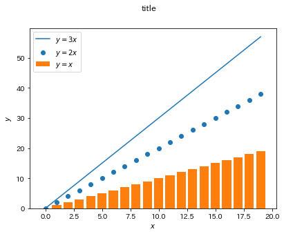
折れ線・散布図・棒グラフの複数のグラフをそれぞれ描画
import matplotlib.pyplot as plt
import japanize_matplotlib
import numpy as np

fig = plt.figure(figsize=(6.4 * 3, 4.8))
fig.suptitle('title')

ax1 = fig.add_subplot(1, 3, 1, xlabel='$x$', ylabel='$y$')
ax2 = fig.add_subplot(1, 3, 2, xlabel='$x$', ylabel='$y$')
ax3 = fig.add_subplot(1, 3, 3, xlabel='$x$', ylabel='$y$')

x1 = np.arange(0, 7, 0.1)
y1 = np.sin(x1)
ax1.plot(x1, y1, label="$y = 3x$")
ax1.set_title("折れ線グラフ sin")
ax1.legend()

x2 = np.arange(0, 7, 0.1)
y2 = np.cos(x2)
ax2.scatter(x2, y2, label="$y = 2x$")
ax2.set_title("散布図 cos")
ax2.legend()

x3 = np.arange(0, 20, 1)
y3 = 1 * x3
ax3.bar(x3, y3, label="$y = x$")
ax3.set_title("棒グラフ $y=x$")
ax3.legend()


fig.savefig('example3.png') # eps, jpeg, jpg, pdf, pgf, png, ps, raw, rgba, svg, svgz, tif, tiff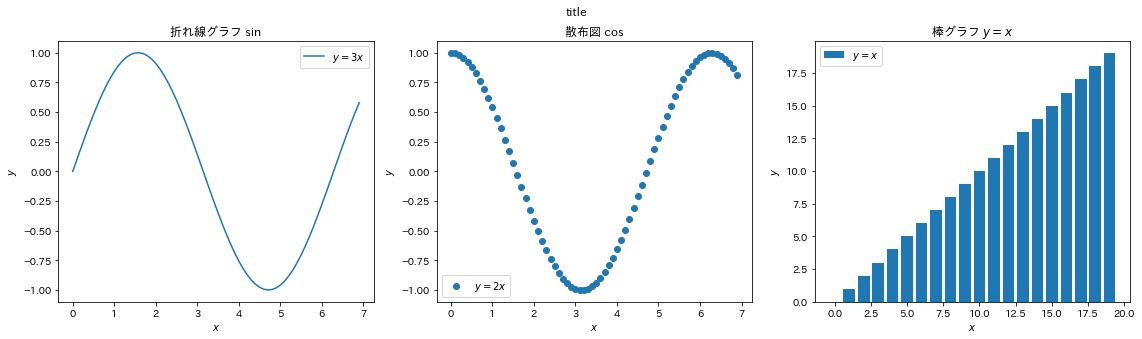
エラーバー付きのグラフを描画
import matplotlib.pyplot as plt
import japanize_matplotlib
import numpy as np

fig = plt.figure(figsize=(6.4, 4.8))
fig.suptitle('title')

ax = fig.add_subplot(1, 1, 1, xlabel='time', ylabel='score')

data = np.random.normal(50, 10, (10, 20)) # 平均50 標準偏差10
x = np.arange(len(data[0]))
mean = np.mean(data, axis=0) # 平均の取得
std = np.std(data, axis=0) # 標準偏差の取得

ax.set_ylim(0, 100)
ax.errorbar(x=x, y=mean, yerr=std, label="平均点と標準偏差")

ax.legend()

fig.savefig('example4.png') # eps, jpeg, jpg, pdf, pgf, png, ps, raw, rgba, svg, svgz, tif, tiff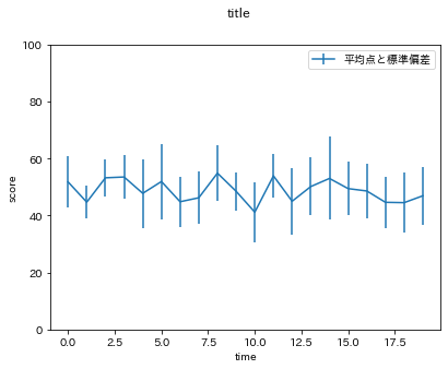
複数の棒グラフを描画 1
https://inchblog.com/blog/how-to-draw-multiple-bar-charts-using-matplotlib
に解説があります.
import matplotlib.pyplot as plt
import numpy as np
import pandas as pd

fig = plt.figure(figsize=(6.4 * 1, 4.8))

ax = fig.add_subplot(1, 1, 1, xlabel='x', ylabel='y')

width = 0.2

df = pd.DataFrame(data=np.random.randint(1, 10, (5, 3)))
#    0  1  2
# 0  1  8  3
# 1  7  2  2
# 2  7  6  3
# 3  9  6  6
# 4  1  4  6

cols = df.columns
df_index = np.array(df.index)
for i, col in enumerate(cols):
    ax.bar(df_index+width*(i-len(cols)/2), df.loc[:, col], label=col, width=width, align='edge')
ax.legend()
fig.savefig('example5.png')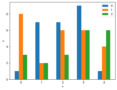
複数の棒グラフを描画 2
https://inchblog.com/blog/how-to-draw-multiple-bar-charts-using-matplotlib
に解説があります.
import matplotlib.pyplot as plt
import numpy as np
import pandas as pd

fig = plt.figure(figsize=(6.4 * 1, 4.8))

ax = fig.add_subplot(1, 1, 1, xlabel='x', ylabel='y')

width = 0.2

df = pd.DataFrame(data=np.random.randint(1, 10, (5, 3)))
#       A  B  C
# 2001  6  5  1
# 2002  8  5  5
# 2003  7  4  6
# 2004  4  3  7
# 2005  8  4  2

cols = df.columns
df_index = np.array(df.index)
for i, col in enumerate(cols):
    ax.bar(df_index+width*(i-len(cols)/2), df.loc[:, col], label=col, width=width, align='edge')
ax.legend()
fig.savefig('example6.png')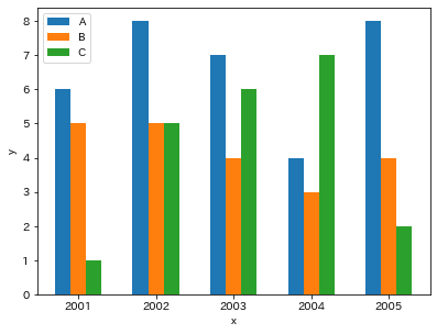
x 軸のメモリ値を回転して描画
from datetime import datetime, timedelta
import matplotlib.pyplot as plt
import numpy as np

fig = plt.figure(figsize=(6.4 * 1, 4.8))

ax = fig.add_subplot(1, 1, 1, xlabel='time', ylabel='value')

time = [datetime(2020, 1, 25) + timedelta(days=i) for i in range(10)]
value = np.random.randint(1, 10, (10))
ax.bar(time, value, label="")
ax.xaxis.set_tick_params(rotation=90)

fig.savefig('example7.png')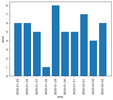
軸のメモリの表記を変えて描画
y 軸をカンマ区切り、x 軸を日付表記にしました.
from datetime import datetime, timedelta
import matplotlib.pyplot as plt
import numpy as np
from matplotlib import ticker
from matplotlib import dates as mdates

def add_comma(x, pos):
    return f"{x:,.2f}"


fig = plt.figure(figsize=(6.4 * 1, 4.8))

ax = fig.add_subplot(1, 1, 1, xlabel='time', ylabel='value')

time = [mdates.date2num
        (datetime(
    year = 2020,
    month = 1,
    day = 25,
    ) + timedelta(hours=i)) for i in range(10)]

value = np.random.randint(1000, 10000, (10))
ax.plot(time, value, label="")
ax.xaxis.set_tick_params(rotation=90)
ax.xaxis.set_major_formatter(mdates.DateFormatter("%Y年%m月%d日"))
ax.yaxis.set_major_formatter(ticker.FuncFormatter(add_comma))

fig.savefig('example9.png')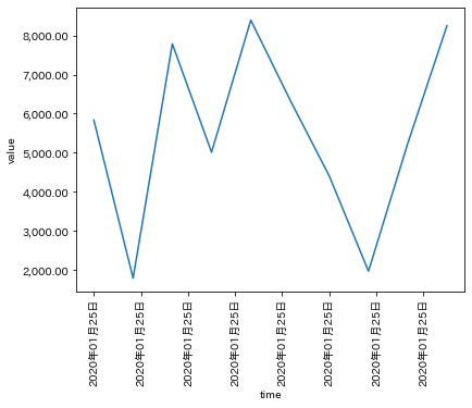
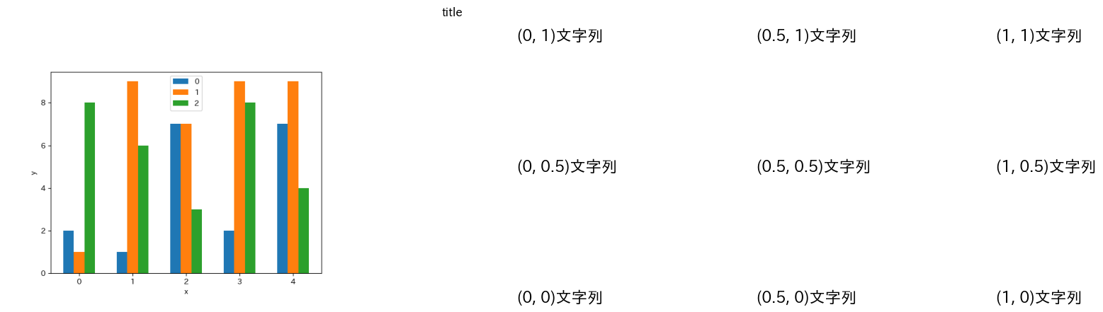
画像と文字列を表示
from datetime import datetime, timedelta
import matplotlib.pyplot as plt
import numpy as np
from matplotlib import ticker
from matplotlib import dates as mdates
from PIL import Image


fig = plt.figure(figsize=(6.4 * 3, 4.8))
fig.suptitle("title")

ax1 = fig.add_subplot(1, 2, 1, xlabel="", ylabel="")
ax2 = fig.add_subplot(1, 2, 2, xlabel="", ylabel="")

img_path = "/content/example1.png"
image = Image.open(img_path)
ax1.imshow(image, label="画像")
ax1.axis("off")

text="文字列"
ax2.text(x=0, y=0, s=f"(0, 0){text}", size=16)
ax2.text(x=0, y=0.5, s=f"(0, 0.5){text}", size=16)
ax2.text(x=0, y=1, s=f"(0, 1){text}", size=16)

ax2.text(x=0.5, y=0, s=f"(0.5, 0){text}", size=16)
ax2.text(x=0.5, y=0.5, s=f"(0.5, 0.5){text}", size=16)
ax2.text(x=0.5, y=1, s=f"(0.5, 1){text}", size=16)

ax2.text(x=1, y=0, s=f"(1, 0){text}", size=16)
ax2.text(x=1, y=0.5, s=f"(1, 0.5){text}", size=16)
ax2.text(x=1, y=1, s=f"(1, 1){text}", size=16)

ax2.axis("off")

fig.savefig('example10.png')
# plt.clf()
# plt.close()